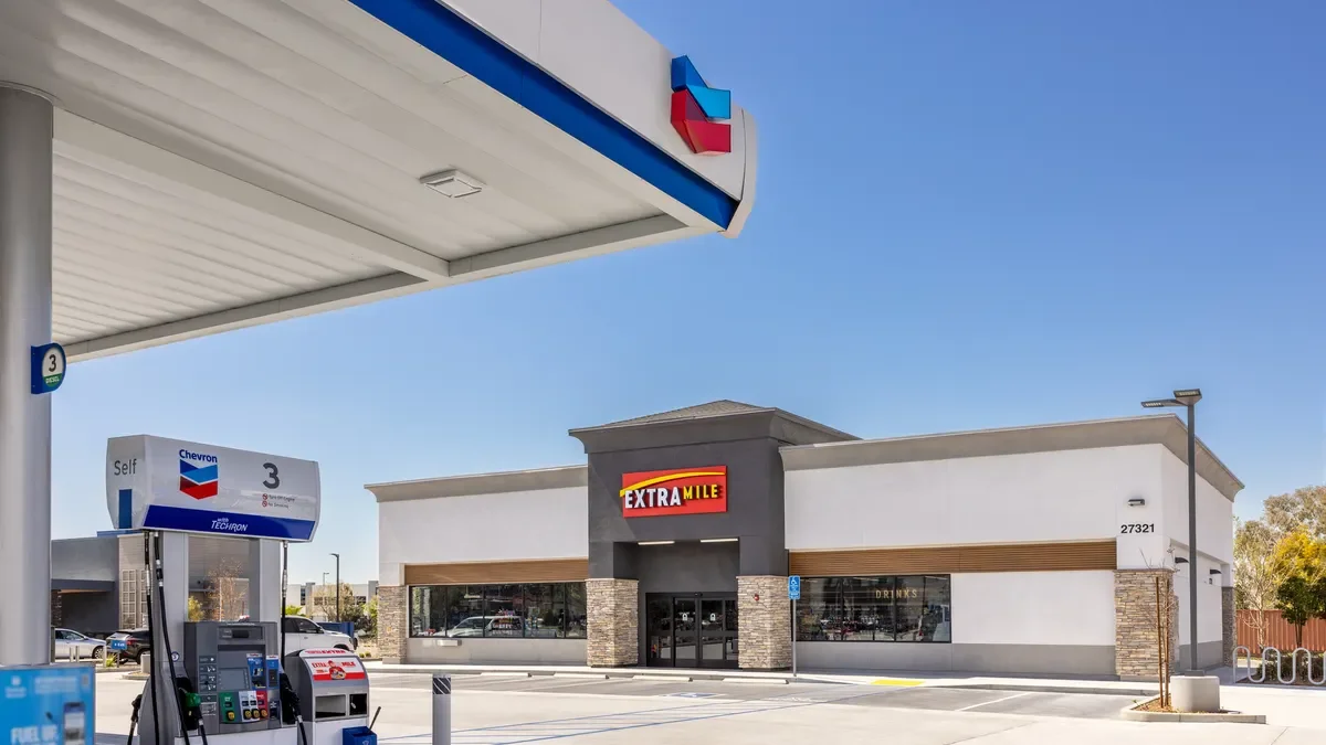
ExtraMile Convenient Stores

While working with the team at Drake Cooper, I had the opportunity to support ExtraMile across a wide mix of creative needs. It gave me a real look at how a large retail brand moves from a simple idea to something customers interact with every day. My work ranged from full brand campaign design to POP systems, outdoor boards, digital executions, and package design. I also helped develop creative for trade show environments and other specialty projects.
2024 Brand Campaign
The Brief
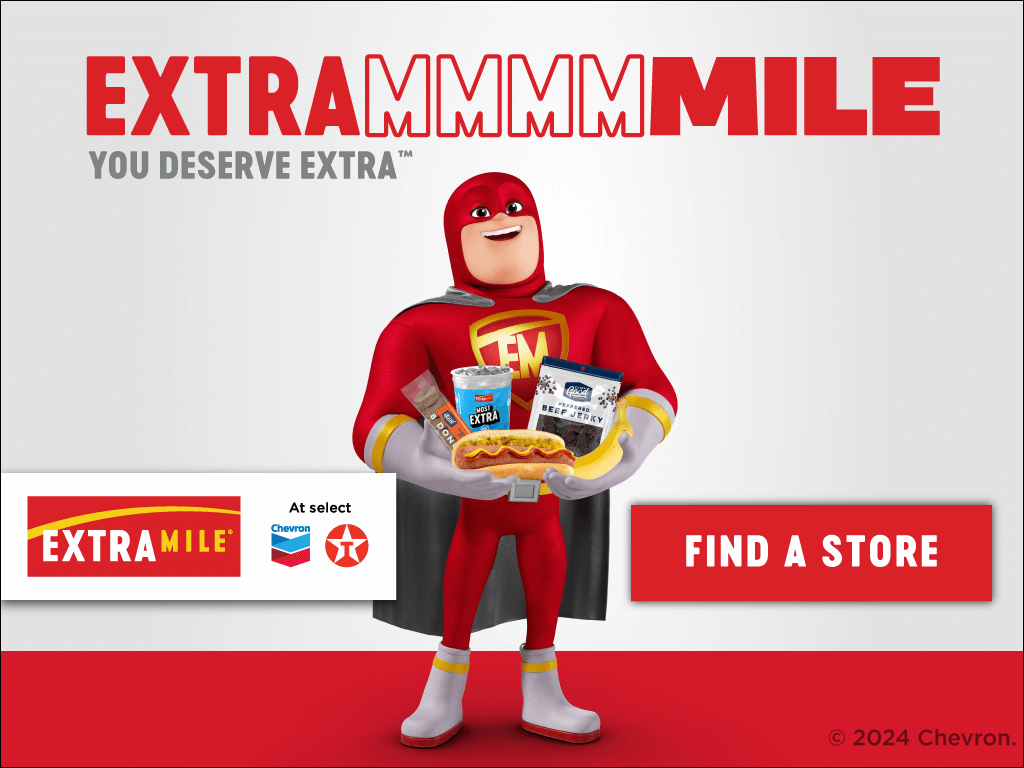
ExtraMile wanted to boost brand awareness and reinforce a simple promise, choosing ExtraMile means you get more. More value, more convenience, more of the good stuff that makes a quick stop feel worth it. They needed a campaign that could communicate this quickly in busy environments and make the brand more memorable.
The Idea
We leaned into a playful word twist by stretching the name into EXTRAMMMILE. The extra M’s worked two ways, they amplified the idea of getting more and they created a natural connection to MMMM, as in tasty, satisfying, and crave worthy. It gave the brand a simple hook that could flex across promotions, food offers, and store messaging.
The Solution
I helped bring this look to life by creating the main campaign visuals, including large format OOH like this hero board. The design had to be bold, quick to read, and full of personality. From there, the system expanded into in store POP, digital assets, physical touch points, and other materials.


Extra Good
Potato Chips
The Brief
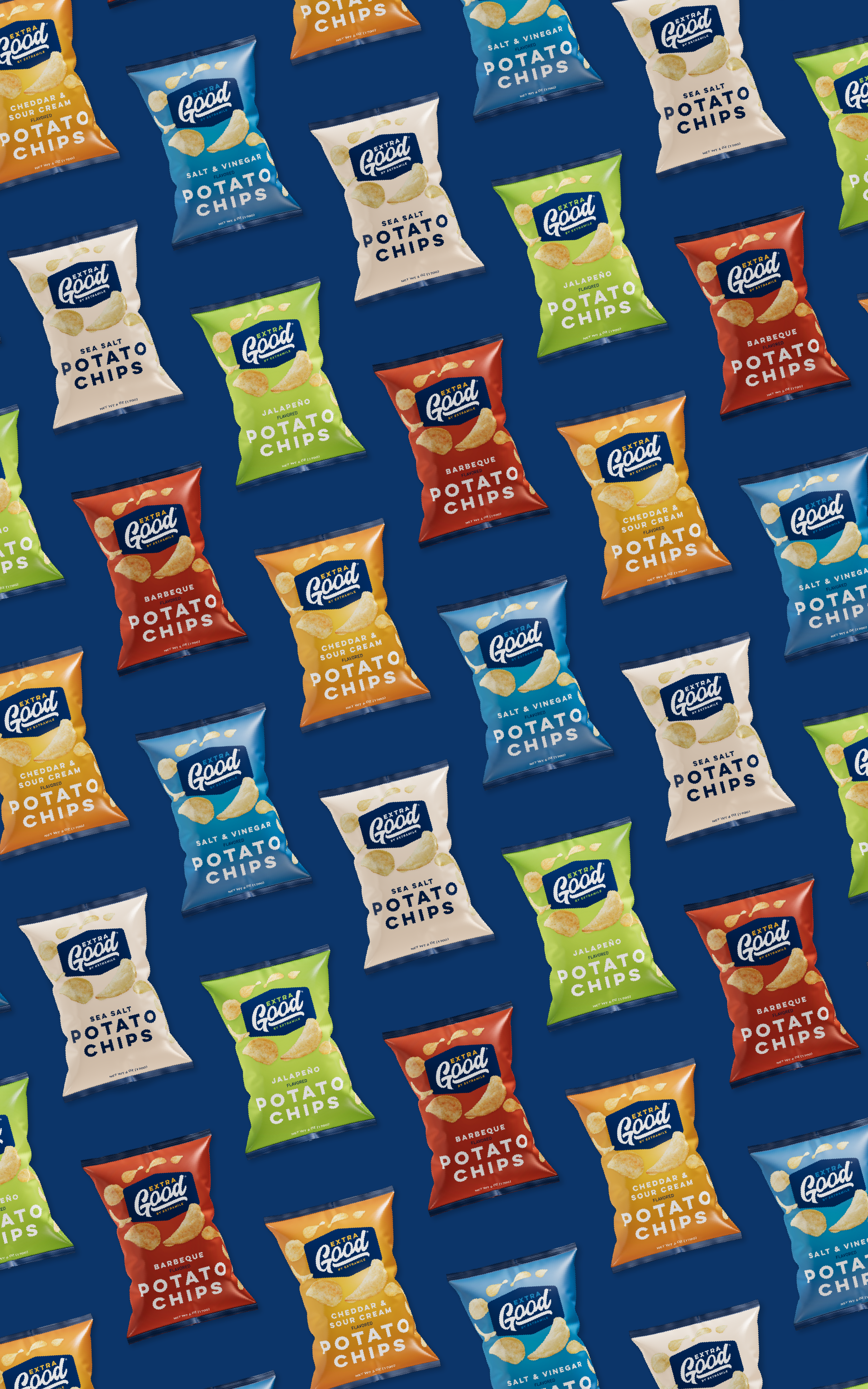
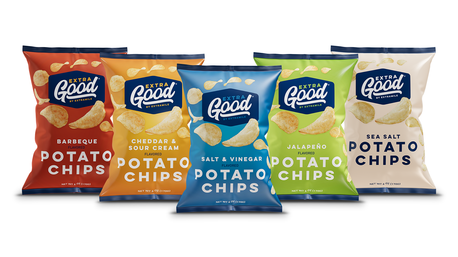
ExtraGood already had a solid brand foundation, but the potato chip bags needed a full redesign to feel more current and more competitive on the shelf. The goal was to make the product look appetizing, easy to identify, and consistent with the ExtraGood personality.
The Idea
We kept the established brand elements and rebuilt the packaging around clearer flavor cues, brighter color palettes, and a simpler layout. The focus was on quick recognition and a clean, friendly look that made each flavor pop without losing the family feel.
The Solution
I redesigned the full chip bag line using strong flavor driven colors, fresh chip photography, and refined typography. The update gave the bags a cohesive, modern look that felt true to ExtraGood while standing out in busy convenience store environments.

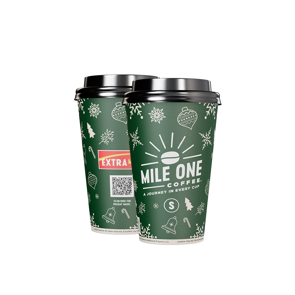
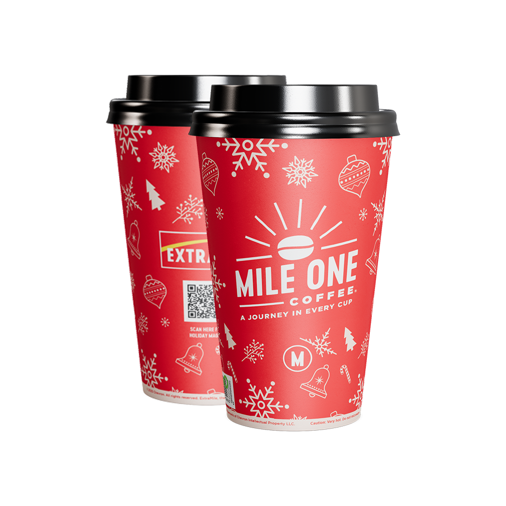
Mile One Holiday
Coffee Cups
The Brief
Mile One Coffee wanted seasonal cups that felt festive without drifting away from the core brand. The goal was to create a holiday look that felt bright, cheerful, and easy to recognize in store while still keeping the Mile One identity front and center.
The Idea
We built a simple pattern system using clean winter icons, snowflakes, and small holiday moments that could wrap the cup in a playful way without feeling cluttered. Each size received its own color to make grabbing the right cup quick and intuitive.
The Solution
I designed the full holiday cup set using a mix of bold colors, simple illustrations, and a clear brand mark. The result was a seasonal update that felt festive, functional, and consistent with the Mile One voice.