

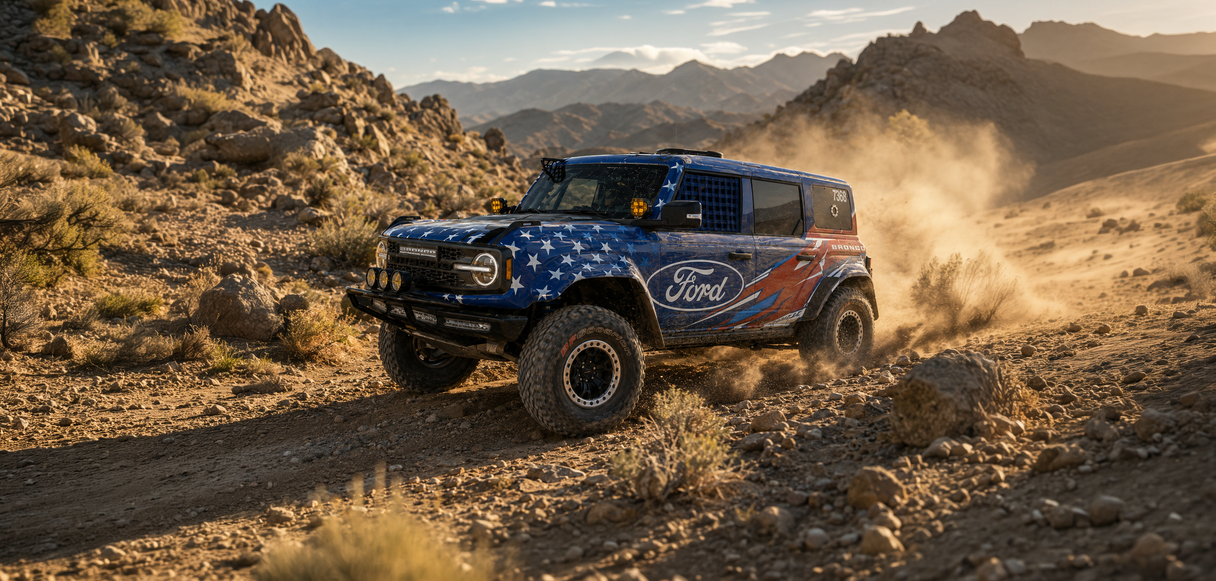
Bronco Raptor Race Livery
Built to Look Fast
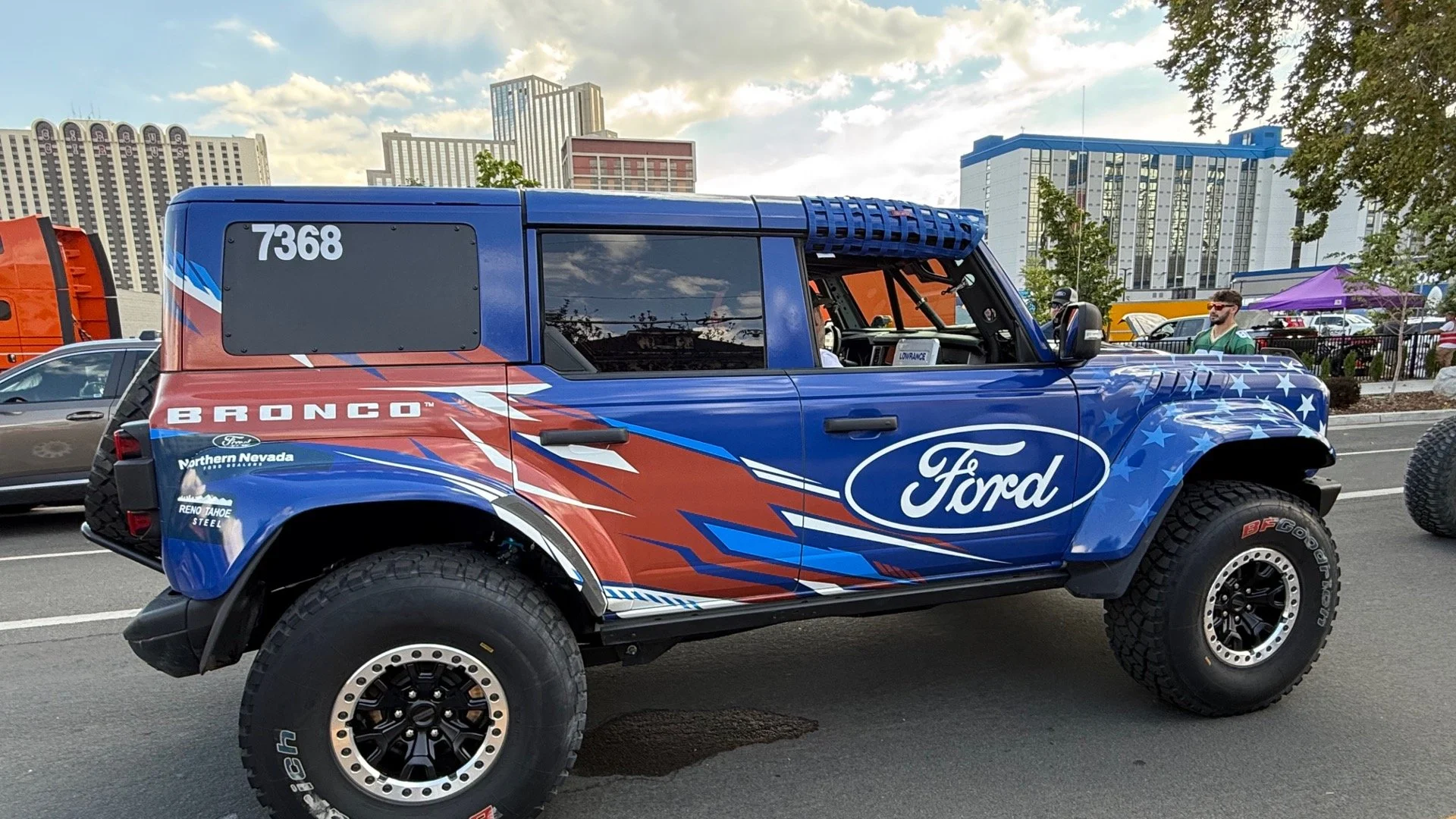
The Northern Nevada Ford Dealers needed a race livery for a Bronco Raptor competing in the Vegas to Reno desert race. The brief was simple: create something energetic, race inspired, and patriotic without defaulting to a traditional American flag treatment.
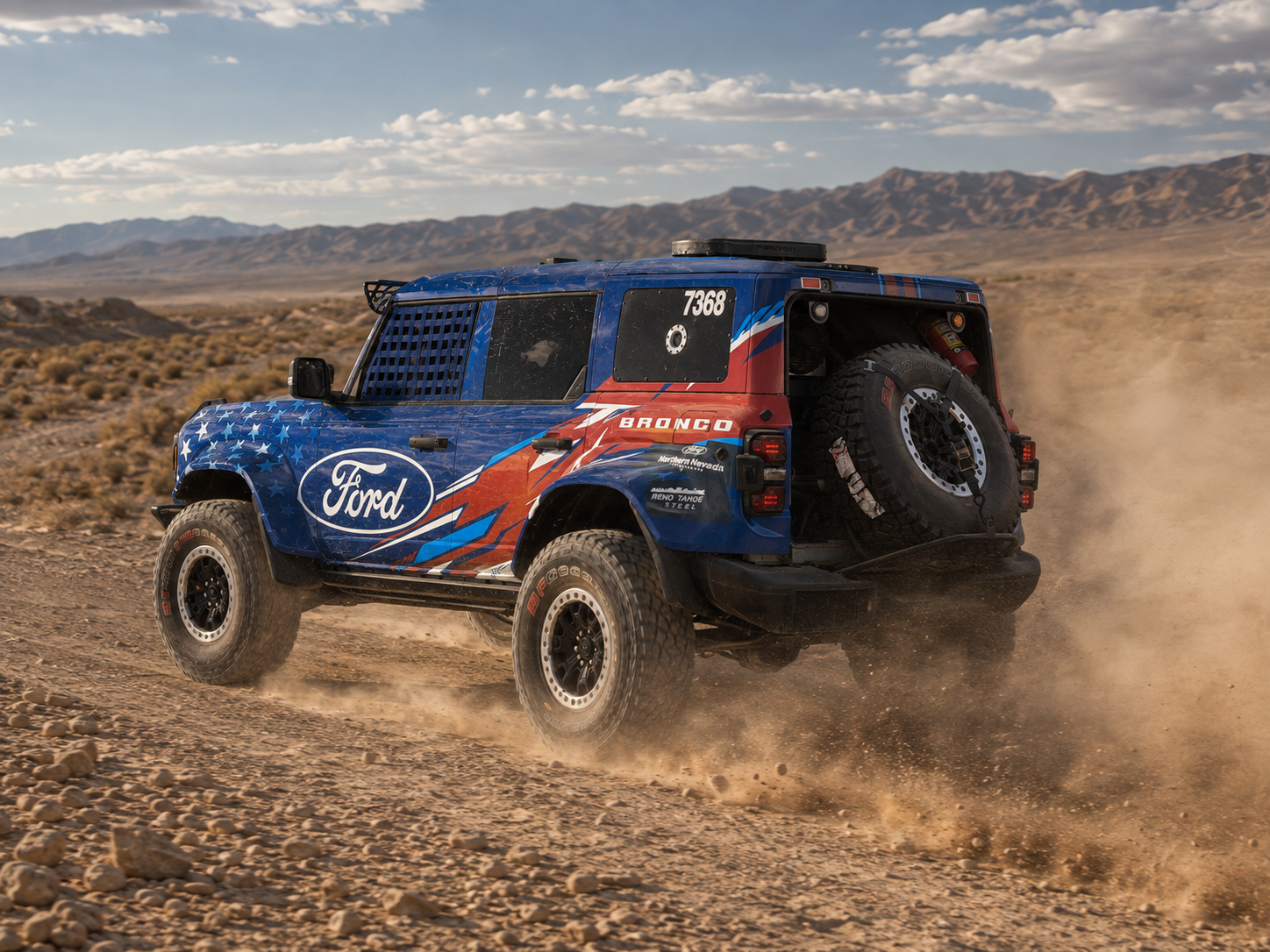
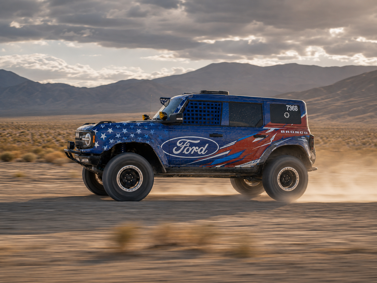
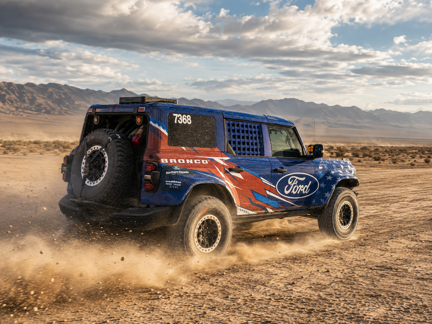
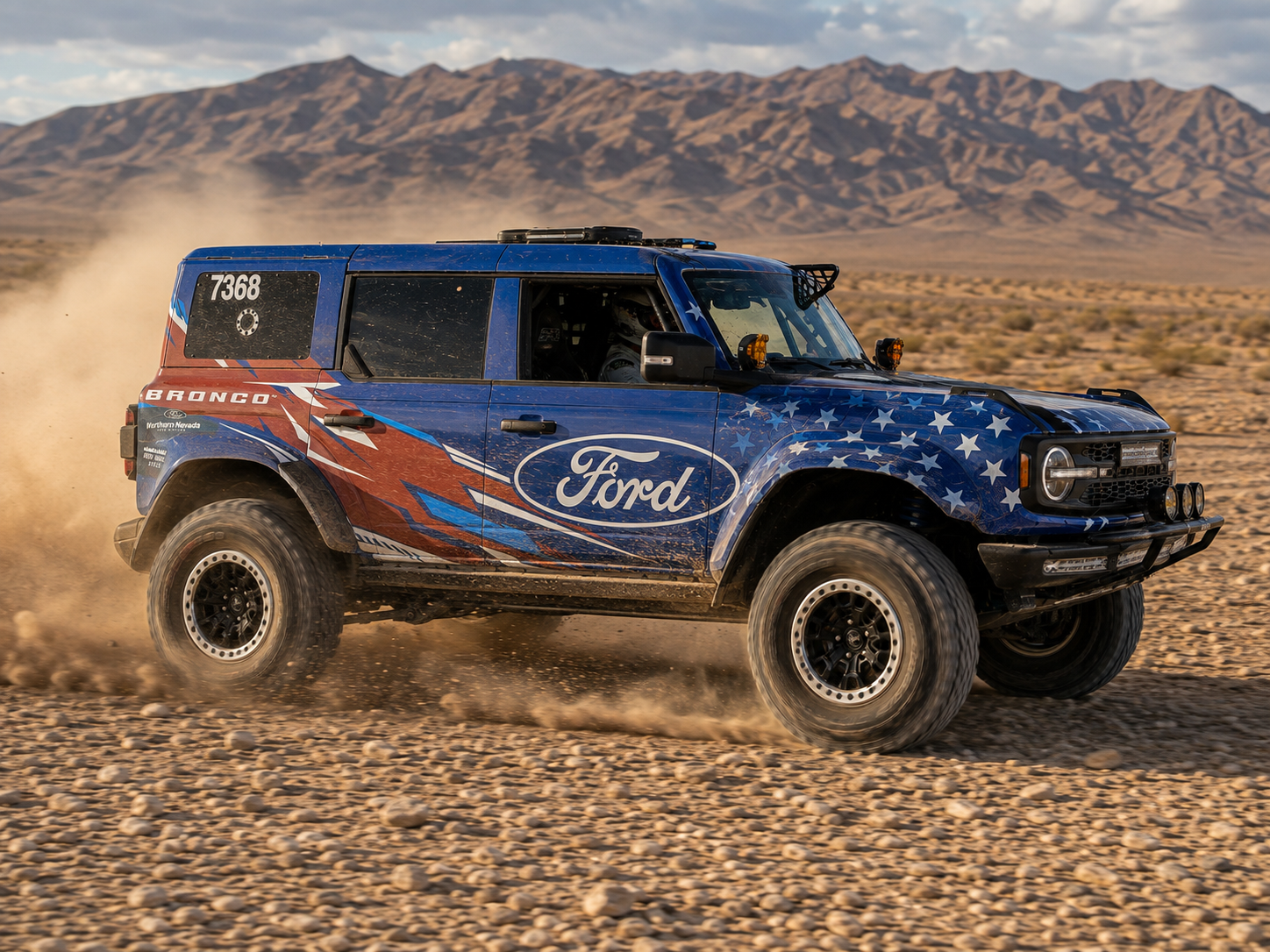
The result was a bold red, white, and blue graphic system designed to feel fast whether the Bronco was sitting still or flying across the Nevada desert.
The Challenge
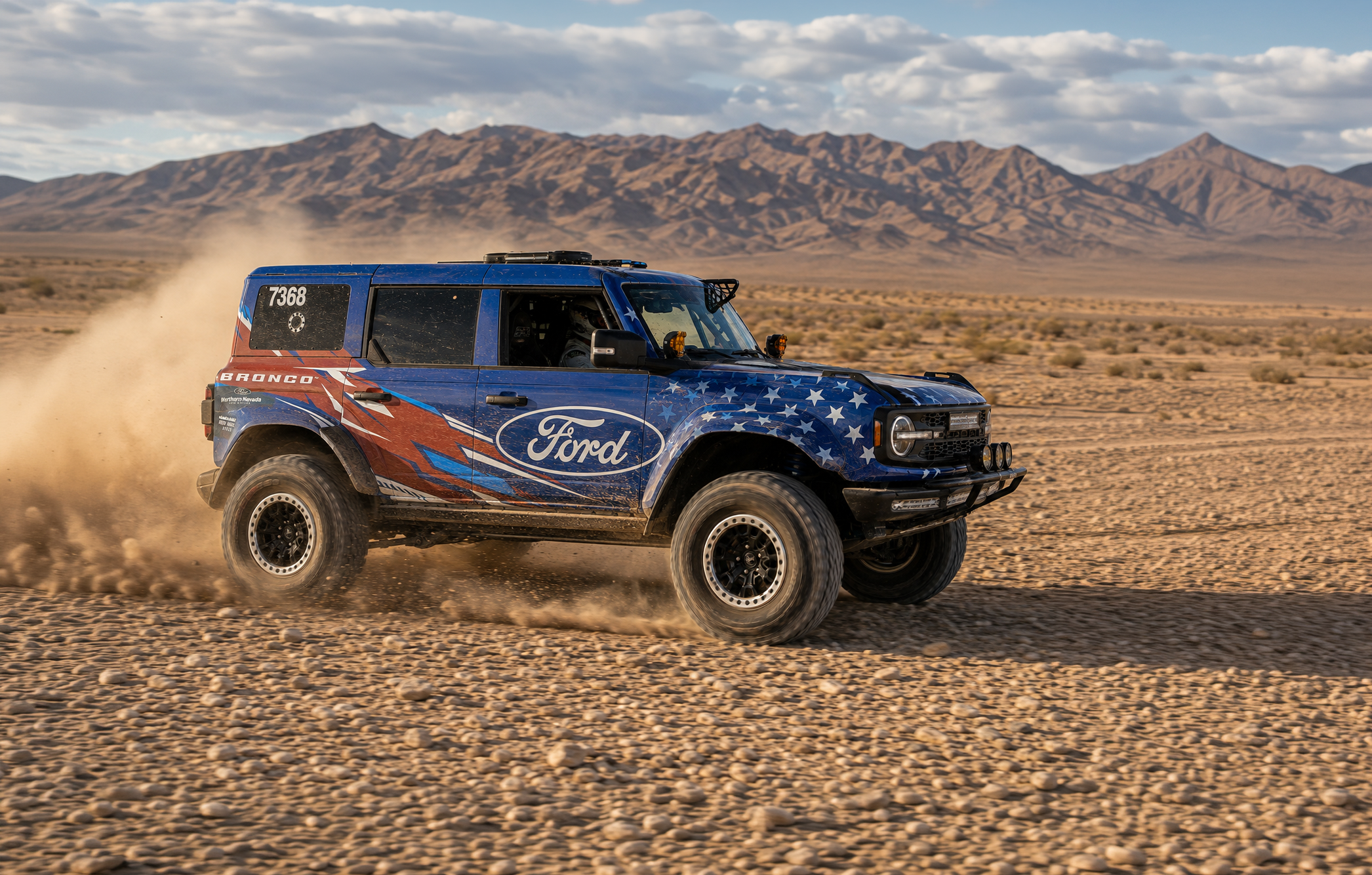
Creating a patriotic race livery meant finding a way to use familiar visual language without creating something predictable.
The design needed to represent the team, incorporate Ford branding, and remain highly visible from a distance and at speed. Rather than relying on small details, the focus was placed on strong contrast, large graphic forms, and a clear sense of movement across the vehicle.
Exploring the Direction
Several concepts were explored during the initial design process, ranging in style and approach. One direction quickly stood out.
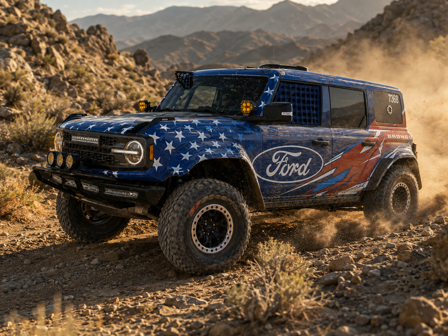
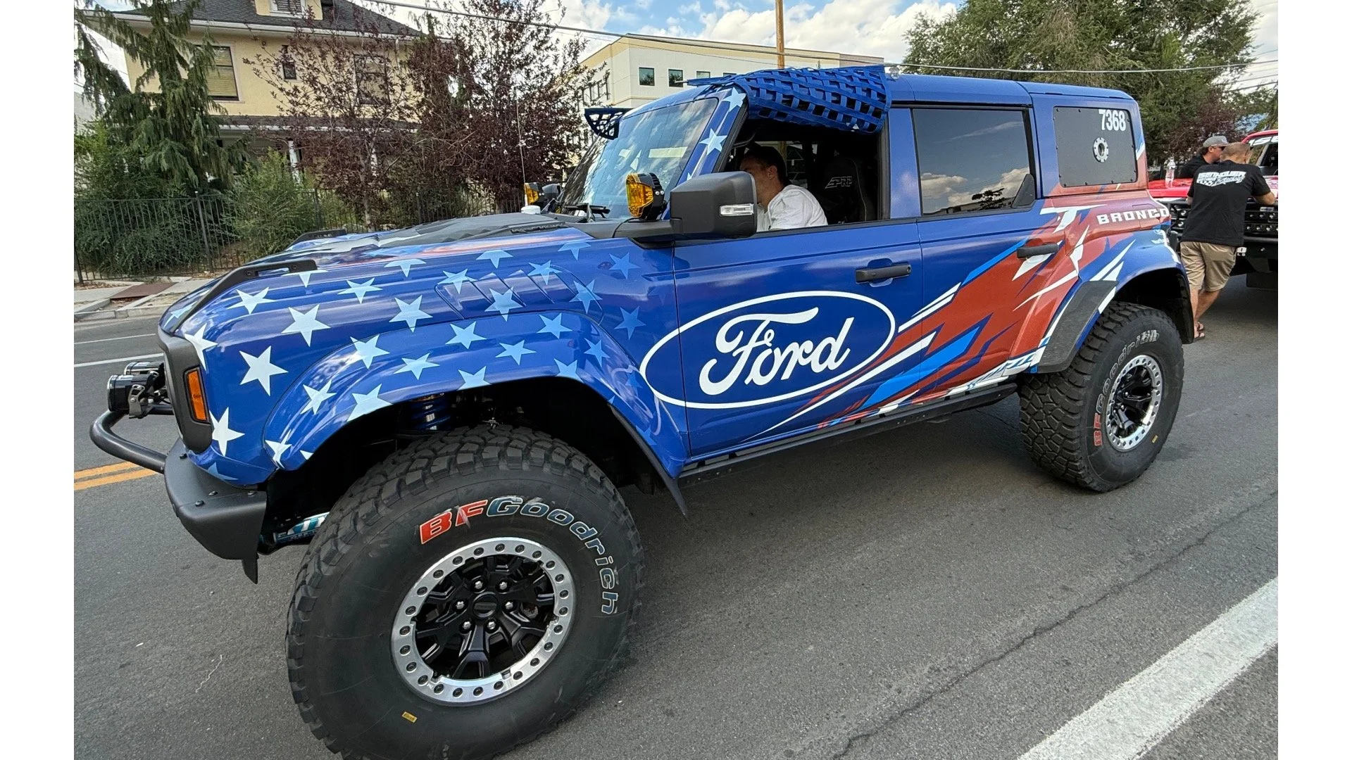
Instead of placing a flag across the vehicle, the patriotic theme was broken down into its core elements. Red, white, and blue established the palette, while stars became a supporting graphic element. From there, the design could focus less on symbolism and more on creating energy.
The Solution
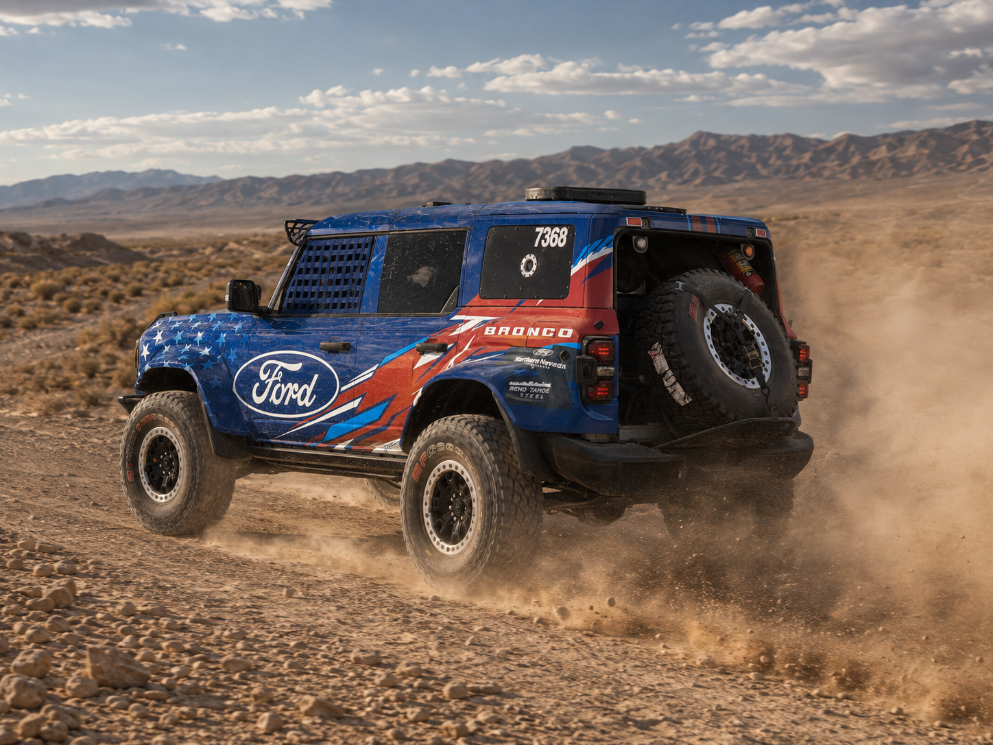
Sharp, geometric forms became the foundation of the final livery. The graphics sweep across the Bronco with aggressive angles and a strong directional flow, creating the impression of speed even when the vehicle is stationary.
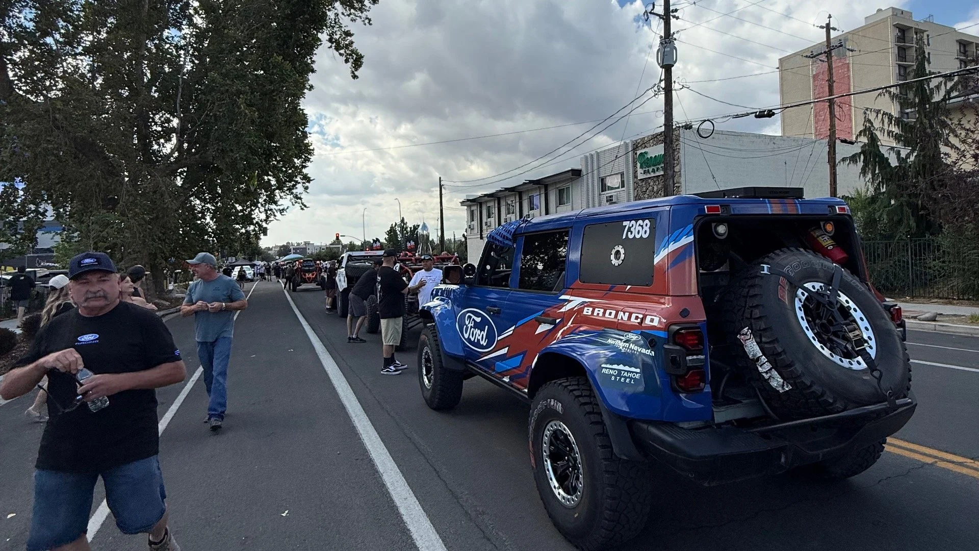
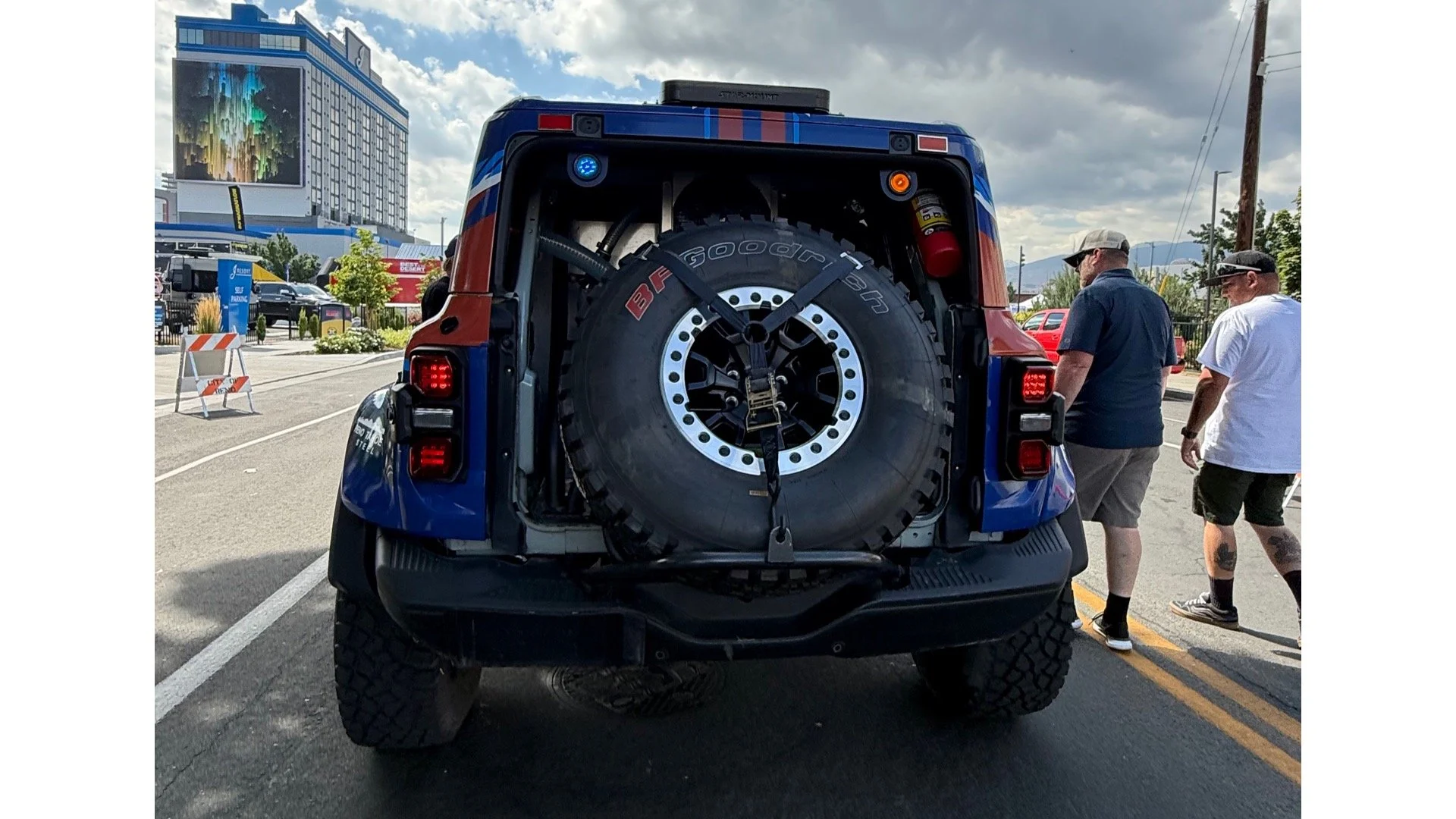
Rather than treating each body panel as an individual canvas, the design was approached as one continuous composition. Shapes move across the vehicle and interact with its proportions and body lines, helping the graphics feel integrated with the Bronco Raptor instead of simply applied on top of it.
Scale was also an important consideration. Since the Bronco would often be viewed from a distance or while moving at race speed, the design needed to communicate quickly. Large fields of color, strong contrast, and recognizable graphic forms allowed the livery to maintain its impact without relying on fine details.
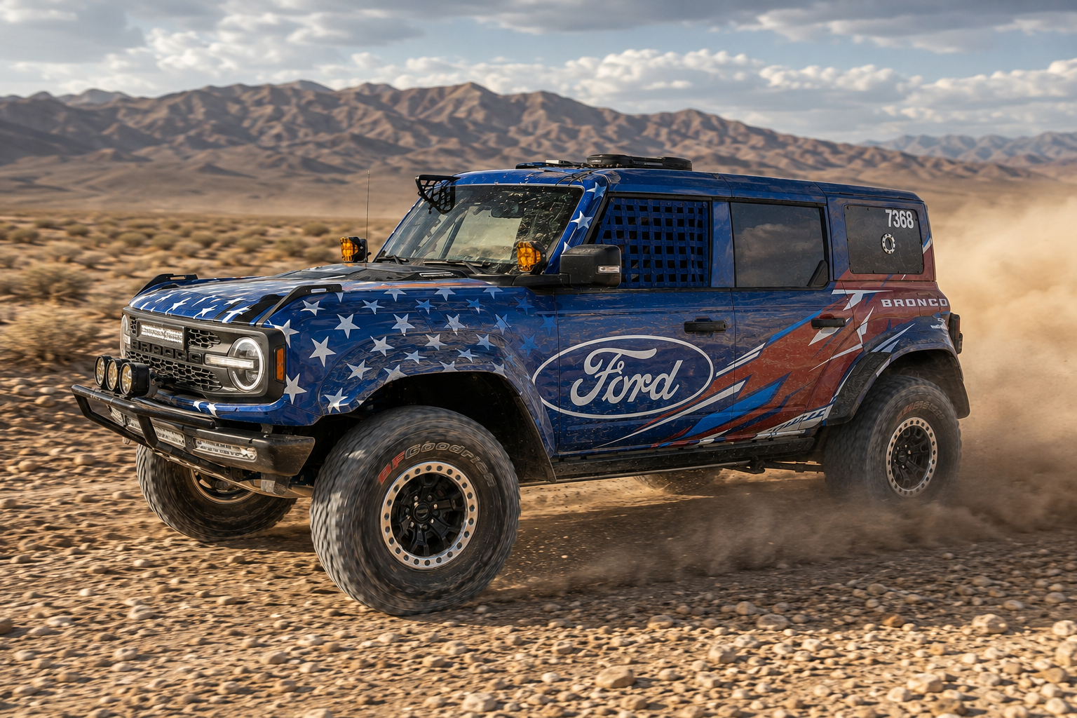
The patriotic theme was kept intentionally abstract. Stars and the red, white, and blue palette provide an immediate connection, while the geometric pattern gives the vehicle a more aggressive motorsports character. Prominent Ford branding and team graphics complete the composition without competing with the overall movement of the design.
The finished livery gave The Northern Nevada Ford Dealers a distinct presence on the course and carried the Bronco through a class winning run at Vegas to Reno.
Client
Northern Nevada Ford Dealers
Agency Partner
Fusion
Services
Concept Development, Vehicle Wrap Design, Art Direction, Production Artwork
Year
2026